Your landing page isn’t just another web page—it’s your first impression, sales pitch, and deal closer all rolled into one. If your leads are clicking but not converting, the problem isn’t the leads—it’s your page.
The good news? Most landing page mistakes are easy to fix. Here’s how to double your conversion rate with smarter, simpler, and more strategic landing pages.
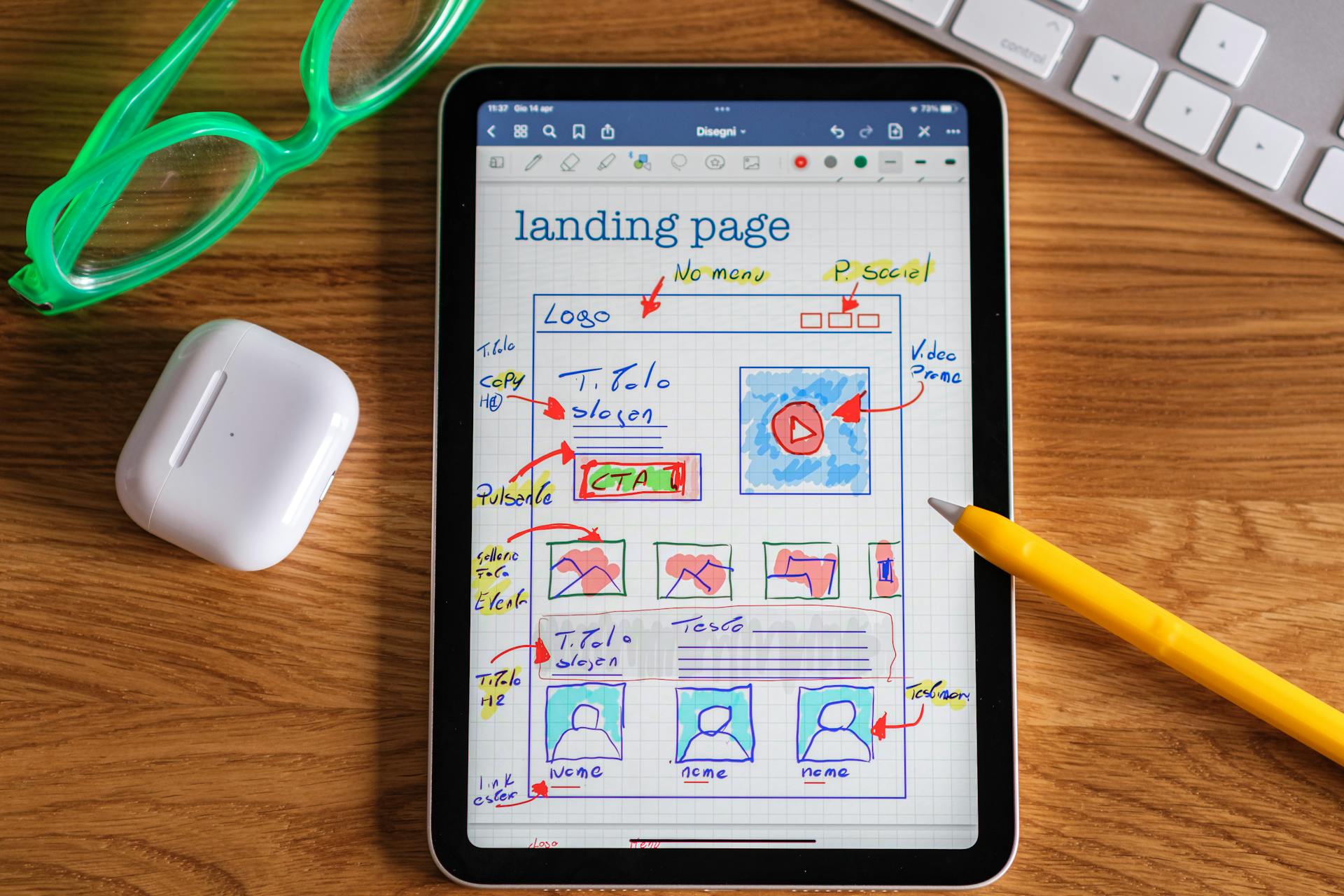
1. Strip It Down: One Goal, One Action
Most landing pages fail because they ask for too much. Multiple CTAs, distracting links, or irrelevant content drive visitors away. Your landing page should do one thing: convert.
Fix It:
• Single Call-to-Action (CTA): Make it clear and bold. Examples: “Get Your Free Quote” or “Start Now.”
• Remove Clutter: No menus, extra links, or unrelated content. Keep the focus sharp.
• Above-the-Fold CTA: Your primary CTA should be visible without scrolling.
2. Make the Headline Hit Hard
Your headline has 5 seconds to tell the visitor why they’re here and why they should care. If you lose them here, you lose the lead.
Fix It:
• Focus on benefit-driven clarity: “Get Exclusive Insurance Leads That Convert 2X Better.”
• Keep it short and impactful: Under 10 words.
• Use strong verbs and numbers to add urgency: “Double Your ROI With Smarter Leads.”
3. Trust Sells: Add Social Proof
Visitors don’t want promises—they want proof. Adding social validation reduces doubt and builds trust instantly.
Fix It:
• Customer Testimonials: Real people, real success. Use names, photos, and specific results.
• Trust Badges: Add logos of well-known clients, certifications, or awards.
• Stats: “97% of clients see results within 30 days.”
4. Speed and Simplicity Win
A slow page is a dead page. Google research shows that pages taking more than 3 seconds to load lose 53% of visitors. And complicated forms? Even worse.
Fix It:
• Test Load Speed: Use tools like Google PageSpeed Insights to check performance. Compress images and streamline code.
• Shorten Forms: Ask only for what you need. Example: Name, Email, and Phone Number—not their life story.
• Mobile Optimization: 70% of traffic comes from mobile. Make sure your page is responsive and easy to navigate.
5. Visual Hierarchy: Guide the Eye to the CTA
Your visitors don’t read—they scan. Use design to direct attention where it matters most.
Fix It:
• Bold Headline → Key Benefits → CTA: The natural flow of the eye.
• Whitespace Is Your Friend: Avoid overcrowding.
• Highlight CTAs: Use contrasting colors that pop but don’t overwhelm.
6. Add a Secondary CTA for Non-Converters
Not every visitor is ready to act immediately. Give them a second option to keep the conversation alive.
Fix It:
• Add a secondary CTA: “Download Our Free Guide” or “Join Our Newsletter.”
• Capture their email to nurture them later.
Case Study: Before vs. After
Here’s a simple example of what works:
Before:
• Headline: “Welcome to Our Company”
• 8 Field Form
• 3 CTAs, multiple links
• Slow load time
After:
• Headline: “Get Exclusive Mortgage Leads in 48 Hours”
• 3 Field Form (Name, Email, Phone)
• 1 Bold CTA: “Start Now”
• 2-second load time
Result: Conversion rates increased by 2.5X.
Final Thought: Smarter Pages, Better Results
Landing pages don’t need to be flashy—they need to convert. By simplifying design, sharpening your message, and building trust, you’ll double your conversion rates and maximize every lead.
Your leads are clicking. Make sure they’re converting. And that involves attracting people who have the right underlying intent as consumer intent and effective landing pages go hand in hand.